the ground up podcast artwork
Penelope’s Popsicles
Penelope’s Popsicles is a gourmet popsicle stand by Cherrylake specializing in both fresh fruit and boozy popsicles. The name pays homage to the Sallin family's first granddaughter, reflecting their commitment to a fun and family-oriented experience.
PROCESS:
Family Fiesta is a cherished tradition at Cherrylake, hosted in collaboration with vendors to celebrate and appreciate Cherrylakers and their families. This lively, family-friendly event brings everyone together for a day of fun. It has been requested that symbols representing this year’s offerings be included and that the branding be bold.
Cherrylake’s family fiesta
PROCESS:
More logos
OUTSIDE Collab Branding Guide
IMG ENTERPRISES Branding Guide
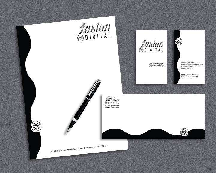
fusion digital
Fusion Digital, a pioneering tech startup, blends cutting-edge technology with the wonders of science. The company strives to achieve a sophisticated, modern appearance while maintaining broad appeal across generations, from Gen X to millennials.
oppr
Operations Processing Project Review is a workflow system that I branded during my time interning on the Exploration Ground Systems (EGS) program at NASA’s Kennedy Space Center. The design resembles a keyhole with colors that are in line with the EGS logo. The red circular shape symbolizes the moon, while the triangular base symbolizes a rocket en route to mars. This tells the story of the overall mission of the EGS program.


